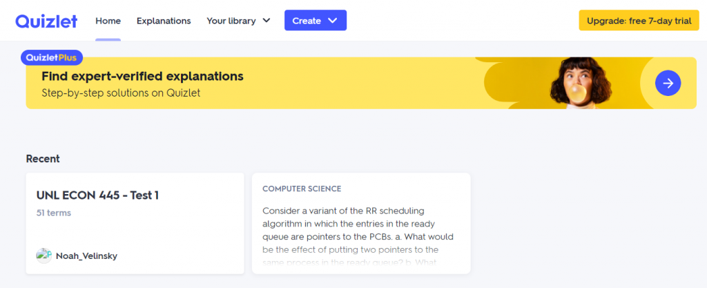
Quizlet is a popular site for students to study. It uses a well-designed UI that makes it easy to create flashcard sets, and the site also features engaging and unique ways to learn material. The main hook of Quizlet is its fresh and fun way of studying — a new way that paper flashcards can’t compare to. Quizlet’s color scheme uses near-complementary and bright colors to match this energy. The warm yellow and striking blue are bold, and very unique to Quizlet. The designers of this website were building on Quizlet’s innovation by creating an interface that also exemplifies newness, excitement, and confidence. Studying for a test generally doesn’t evoke these sort of feelings in a student, but Quizlet has done an excellent job of making an environment where studying seems fun.
In order to show the effectiveness of this specific color combination, I wanted to compare it to some additional versions that cover a range of moods.

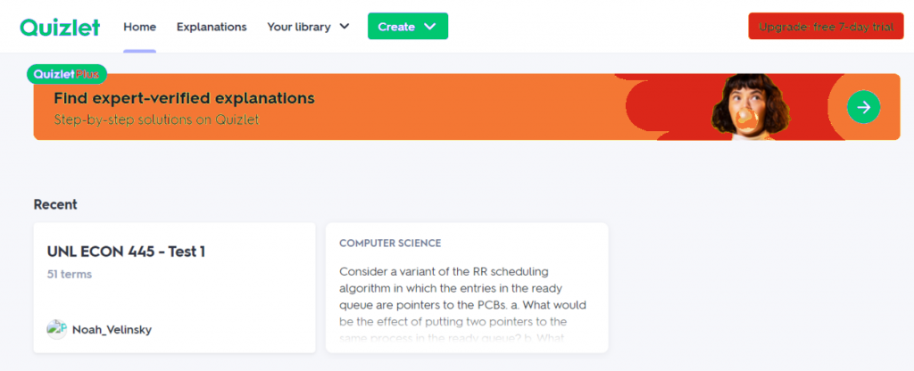
Here, we change the near-complementary palette into an analogous one. Blue and purple are much closer in hue, and the value of this color matches the brightness of the original blue. In this version, the palette is much cooler, which reflects a more relaxed and slow feeling to the user. The purple is rich and comforting, unlike the bright bubbly yellow. This palette just doesn’t convey the excitement and fun attitude that the original does.
Next, we try another near-complementary palette — a bright green with an orange-red. This palette does a good job matching the energy and spunk of the original, but it lacks a studious feeling. Without the bright blue, we seem to lack a sense of erudite — which blue often evokes. Secondly, the red color can be alarming and confusing, since users are accustomed to red being a signifier for exit, warning, or cancel. While this palette is still bright and bold, it lacks the smartness and warmth of the original.
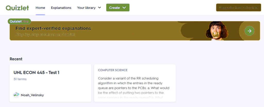
As a deviation from bright + bold, I wanted to see what a calmer, more natural palette would look like. Aside from the obvious lack of clarity in the text, this darker brown color still brings warmth, but unfortunately fails to feel exciting or bold. It is clear that Quizlet’s colors need to match it’s bright and innovative goals, and using a natural palette unfortunately creates a more calming and content effect in the user. The sense of urgency is missing — a sense that is very important in the motivation to study.
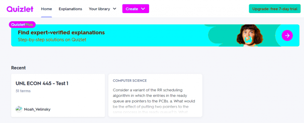
Finally, I wanted to try the most bold and bright colors I could imagine so that we could study the effectiveness of the original hues. These colors are absolutely exciting, and they definitely inspire the fun and whimsical feeling that Quizlet is aiming for. What’s lacking from this palette is the studious vibe that comes from the deep blue. This palette is all play, no work, whereas the original strikes a balance. Magenta and cyan are also harsh colors to use, and they don’t exactly fit a certain scheme like complementary or analogous. Maybe with the addition of yellow, this triad could be effective, but with only these two colors, the scheme is strangely lacking to the eye.
Throughout this analysis, it becomes clear that colors evoke very specific emotions and moods. While this may not be a perfect science, and will definitely vary person to person, Quizlet has done a great job of choosing a color scheme that matches their values and goals. Any student on their site will appreciate the fun yellow side that Quizlet brings into the studious blue, and will also enjoy the many features that Quizlet offers.